Tables & figures
Aim
To present the results of your analysis in a correct, clear and well-organized way for both a manuscript of (poster) presentation.
Documentation
- Tables and figures as submitted in manuscripts
- Tables and figures as used in (poster) presentations
Responsibilities
Executing researcher: To present the results in tables and figures in a correct and clear way, so they are interpretable without the main text. So, including explanation of abbreviations and used statistical models.
- Note, tables and figures for a manuscript or (poster) presentation have a different purpose and therefore slightly different guidelines.
Project leaders: To advice and evaluate the executing researcher regularly on clear presentation of results in tables and figures.
Research assistant: N.a.
How to
It is important to present your results in a clear and well-organized way in tables and graphs, since this will make a significant contribution to the understandability and visualization of your manuscript, poster or PowerPoint presentation. The choice of presenting results in a table or graph depends on the aim, number of variables, analysis methods and personal preferences. For an overview of presenting data in tables and figures, please refer to http://dx.doi.org/10.1136/heartjnl-2017-311581 and http://dx.doi.org/10.1136/annrheumdis-2018-213396.
Manuscript
Tables and graphs need to be produced in such a way that the reader is able to understand them without having to read any additional text. The title needs to be informative and the rows and columns in the tables or axes of the graphs need to be properly labeled. All abbreviations used need to be explained in full in a footnote below the table or graph. In general, tables are appropriate when you want to display the exact numbers from your analyses. Graphs are more appropriate for displaying trends or associations. Some journals have a fixed policy on the number and design of tables and graphs, usually a maximum of 4-6 tables and figures. Before submitting your article to a journal, it is recommended to check the journal’s policy about tables and figures.
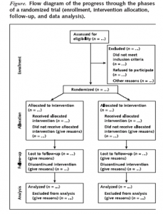
When presenting the inclusion of participants in a RCT, the majority of medical journals require a “patient flow chart”. This represents how many patients were approached, which ones were selected and excluded (and the exclusion criteria), the dropouts and the number of patients ultimately remaining who participated in the trial. Templates of the CONSORT flow diagram are available online.
Conducting a systematic review, a flow chart could be used to map how many articles have been scanned, how many full text articles have been requested and how many articles have been included. A flow chart can also be useful in clarifying a complex treatment protocol.
The baseline table often includes socio-demographic variables, such as age, sex and educational level. It also often contains the most important clinical characteristics describing your population, such as the severity of the disorder and general health status, and the baseline values of the determinants, outcomes and potential prognostic variables. Templates of the PRISMA flow chart are available online.

In tables and figures, effect estimates (e.g. average difference, relative risk or odds ratio) should always include a confidence interval to indicate the spread around your effect estimate.
For (multiple) linear regression analysis the regression coefficient(s) (B) should be included, including the standard error(s) or a confidence interval. The p-value may also be included. However, this is not necessary if you present confidence intervals. Often odds ratio(s) and the 95% confidence interval are included in (multiple) logistic regression analyses.
For an association model, it is recommended to include both the raw effect estimates (e.g., odds ratio with 95% confidence interval), as well as any adjusted effect estimates (e.g. adjusted for age).
For a prognostic model, a measure of how well the model works needs to be included along with the regression coefficients, e.g., percentage variance explained or distinctive power (e.g., area under the ROC curve). For a prognostic model it is also necessary to properly describe the strategy used in selecting the variables and the criteria for including variables in the model.
Please note that there is an ongoing discussion among scientists about the use of the p-value in science. Be aware of the limitations of the p-value and interpret them correctly. For more information, see Wasserstein et al. (2019).
Presentations
The same criteria for tables and figures are applicable for presentation as for the manuscript. However, the aim is here to highlight the most important results and not provide an exact correct overview of all results. It is therefore important to avoid complex or large tables or figures and to just show the essential parts. For a (poster) presentation your aim is to spark an interest.